The Small Business Owner’s Guide To Data Analytics
Dear small business owners,
I hope that the oncoming depressing sentence doesn’t end up upsetting you but if it does, please bear with me because I empathize with you and want to suggest something which will not only be useful but it may open up a new horizon for your profitability.
In comparison with the large businesses, our position is quite vulnerable in multiple aspects such as financial standing and cash flow, strategy, client reliance, being updated with the market, leadership dependence, balancing quality and growth, access to cutting-edge technology, customer retention, supply chain management, inventory control, handling price fluctuations, employees evaluation, sensing a customer going away, control on operations, etc to name a few. As small businesses, we do want to help our customers and offer them great deals but there are limitations on how generous we can be to them.
In such a scenario there is a tool if applied correctly, effectively, and smartly can give us a great help to smartly counter the challenges posed by the mighty large-size competitors. That tool is Data Analytics.
What exactly is Data Analytics?
Data Analytics is a buzzword nowadays, and it’s also branded as ‘the next big thing.’
Data analytics is a set of processes to collect data from various sources, transforming that data using well-defined algorithms, and organizing it in a way that it reflects meaningful conclusions to support informed decision-making and also to predict future trends and patterns.
Companies collect large amounts of data every moment from many types of data-feeding sources such as mobile phone sniffers, loyalty cards, financial transactions, point of sales, web page visits, online purchases, social media interactions, text input on any net-connected devices, and literally from every device we can and can not think of.
But that data as it is collected in large amounts (which is called raw data) doesn’t make any sense unless we have those exceptional superhuman abilities (thank God we don’t have that.)
Therefore we need ‘something’ which can synthesize and analyze the raw data and derives some meaningful and useful information out of that intimidating jumble. ‘Data Analytics’ is ‘something’ that can do that for us.
It’s an art or science which can create a picture of meaningful information for us from scattered jigsaw pieces called raw data.
Data Analytics is a process of analyzing raw data to help us extract useful ‘insights’ which are not only important but inevitable to make business decisions.
Why should small business owners use data Analytics?
If I want to describe it in the shortest way possible, It’s “if you want to figure out how to provide exactly the right product at the right time, exactly to the right customer, data analytics is the tool you must use.”
Data analysis allows you to conduct an objective assessment of your business.
You have to use Data Analytics to give your customers better service, reward them for their loyalty, to offer them a supportive product/service for the product they are going to buy. And also to predict if they’re going away from you.
You can also predict what’s happening in your customer’s life by looking at the data of their buying behavior (for example if a customer starts purchasing nappies and infant milk powder, there has been the arrival of a baby in their life. So you can help them get those things that are necessary for their parenthood.)
As owners of small businesses, it is crucial to understand what all that data means and what messages that data is conveying to us. Only then we can make informed decisions that can lead the business to healthy growth.
Here are some of the things small business data analytics can tell you:
- Where your business stands now
- Where your company goes if the trends remain the same
- The growth potential of your business
- How long it should take to expand your brand
- The steps to take to make the expansion happen
Note:
- The data must be analyzed daily, weekly, monthly, quarterly, and annually to get answers to all these questions.
- But one problem is the struggle to understand data. But we will see in the coming pages that it’s also not an issue provided you have a trusted pair of hands on which you can rely to take care of all the data-related operations.

What are the benefits of Data analytics?
Data can point us in the right direction, and prevent us from getting in the wrong direction by showing us objective and unbiased facts.
- For instance, by looking at the crowd in a giant supermall one can be tempted to get a place in the same supermall. But the reality can only be reflected when we look at the numbers of people visiting and people actually spending money there, and what is selling in what amount.
We can study the trends through various patterns in the data that help us in describing what happened, diagnose the exact issues, predict how the market will behave, and prescribe appropriate actions to deal with or take optimum advantage of the oncoming trends.
We can adapt data-directed thinking processes and decision-making.
If we want to understand our customers and figure out better and more profitable ways to help them, and also understand the behavior of our own organization to make it more operationally efficient, we certainly need to give data strategic importance.
We can logically devise strategies for expansion.
Other than these, there are a few more ways we can also apply Data Analytics to gain many other benefits. Some of them are as follows.
- It helps us reduce costs by shortening tasks, and in many cases eliminating them altogether.
- Organizational efficiency can be increased significantly by Increased operational efficiency.
- Data doesn’t lie. It helps us identify the exact weaknesses and failures.
- We can design new products and services based on Predictive Analysis and Prescriptive Analysis.
- Data can give us 360-degree customer reviews so we don’t have to rely on subjective spot surveys.
- Through thoroughly conducted Data Analytics it becomes easy to spot leakages which makes it easy to identify and prevent fraud.
- Data Analytics can also help us optimize pricing strategies.
In short, Data Analytics helps us make smarter logical business decisions.
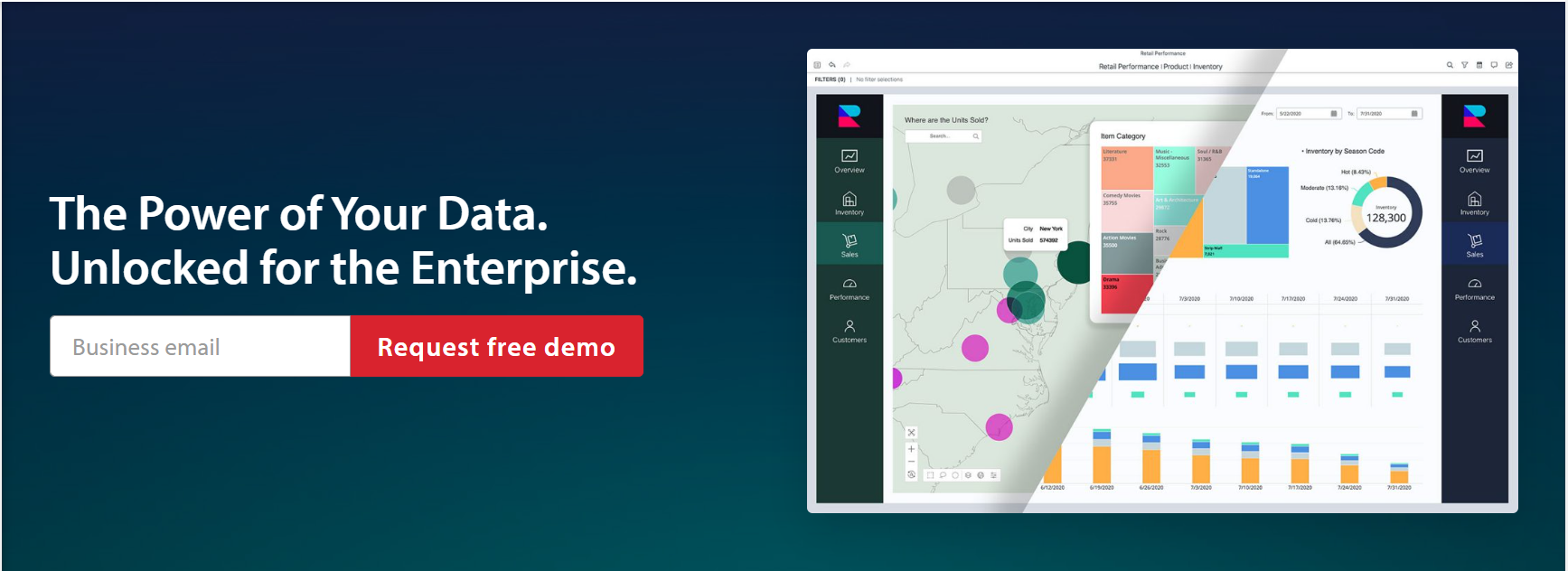
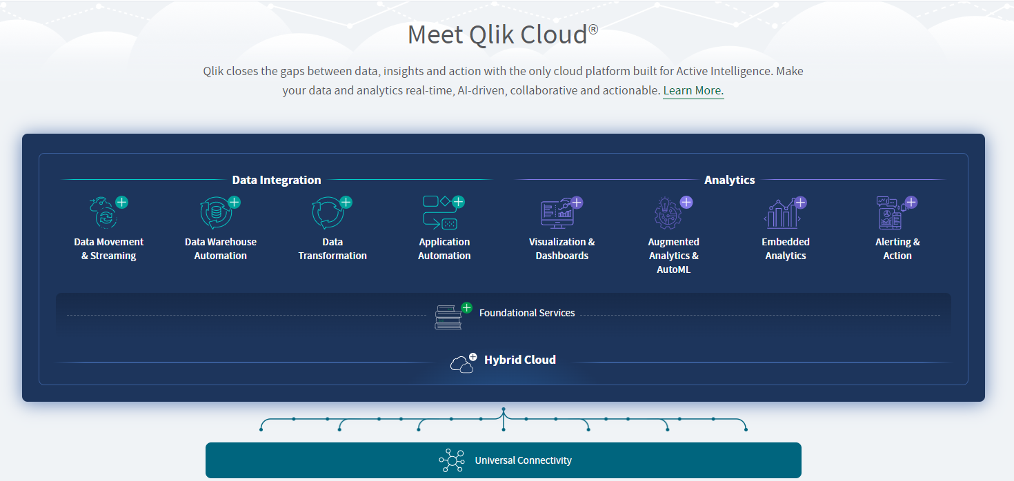
Which BI Tools / Which technology tool should they select?
There are a number of BI tools to choose from, with different specialties. So it depends on your business needs and which functions of a BI tool you want to employ. Are your needs basic, or do they demand complex analysis? However, these are the basic criteria one should consider to select the best fit for one’s business.
- Capabilities to collect data collection
- Analytical abilities
- Visualization facilities
- Customizable reporting tools
- Customizable dashboards
- Predictive analytics
- Integration ability with other tools
- Security
Here we are briefly explaining a few good BI tools. If you wonder which would be a better option for your business needs, please contact us for the best data analytics services and solutions. They will be happy to support you in choosing the right Data Analytics tool for you.
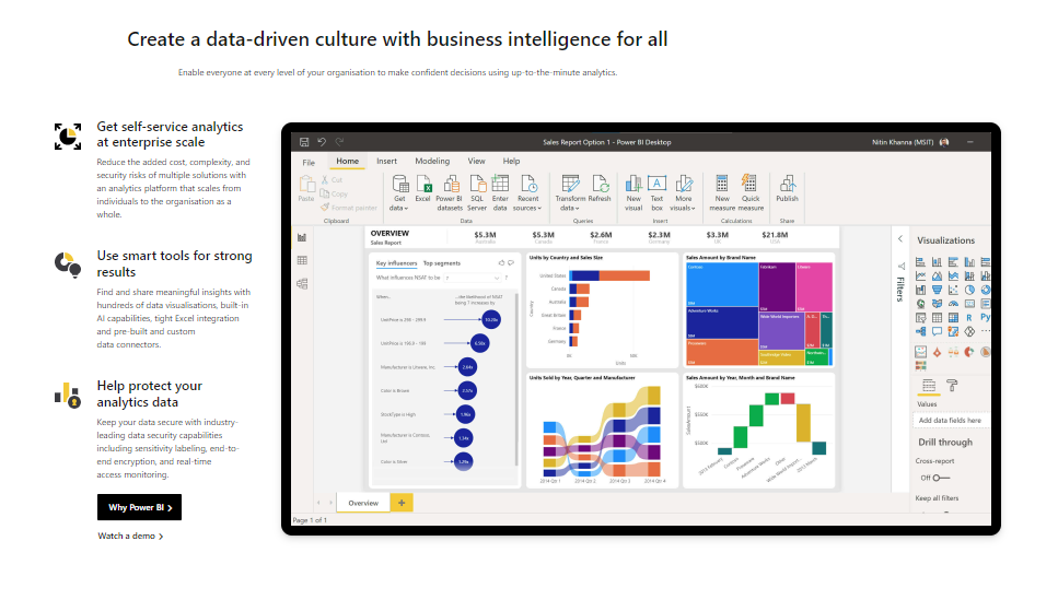
- Microsoft Power BI enables you to transform, explore, and analyze data on-premise and in the cloud. Also, it creates real-time visualizations and can connect relatively easily to your own data sources.
- Zoho Analytics has perhaps the most beautiful interactive dashboard. It supports multiple source data collection, and the data can be easily integrated through a simple interface and exports the results to various platforms and ecosystems.
- Scoro is good for its customizable KPI dashboard and real-time overview of every aspect of your work.
- Dundas BI is an end-to-end business intelligence platform with an open API across the entire platform. With drag-and-drop tools, it can quickly transform raw data into the form of dashboards, reports, and visual data analytics. Its ability to connect and integrate with other data sources is remarkable.
- Sisense can incorporate AI-enabled applications that can be embedded and integrated with a wide variety of sources and doesn’t require specialized training. It can get real-time data feeds to create intuitive dashboards and reports.
- MicroStrategy supports both data mining and visualization. It offers a multi-functional dashboard, big data solutions, and advanced analytics.
- Halo combines automated data processes with manual data manoeuvres for custom results. Its data integration, supply chain analytics, and visualization are automated and available in a single solution. For supply-chain management, this is most suited. Its intuitive interface allows multiple users to collaborate in real-time.
- Oracle has a large array of BI capabilities. It uses the Common Enterprise Model for calculations and business analytics and offers inbuilt tools for mining data, sending alerts, and data discovery which is rather agile. Its workspace is also easy to use and allows multi-user collaboration.
- SeekTable can perform ad-hoc analysis of all multiple sources of business data at once. It comes with facilities such as data restriction, live interactive reports, sorting, filtering, etc. It offers data analytics while allowing users access to reports.
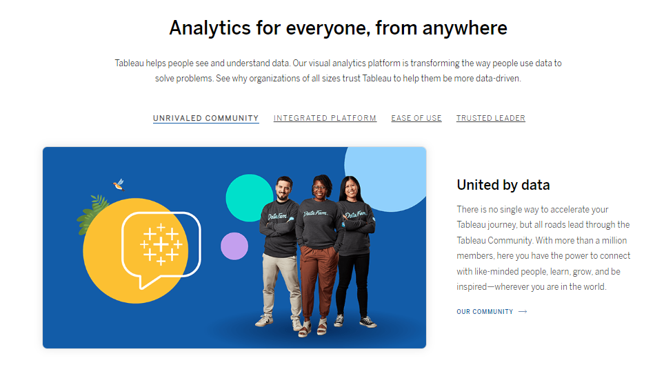
- Tableau is a long-time tried and tested BI tool for live visual analytics. Its highly intuitive interface and drag-and-drop facility allow users to observe live trends. It features a mobile BI strategy and in-memory architecture for data visualization and exploration. It’s easy to integrate with Microsoft SharePoint and offers one-click reporting.
- GROW allows the extraction of data from over 115 sources, including Dropbox, Salesforce, Twitter, Google Analytics, etc. It features a highly intuitive UI with several data visualization elements. It also facilitates importing data from social media platforms such as Facebook, Twitter, LinkedIn, and more, helping optimize the marketing budget.
- Datapine facilitates and allows the visualization of many key metrics simultaneously. It’s an interactive BI tool featuring enabling versatile filters, mobile optimization, ad-hoc data source queries, fast and efficient connections to multiple data sources, predictive analytics, and data alarms based on customizable triggers.
Other than these there are many more intelligent BI tools such as Syn Enterprise, BigID, Qualtrics Research Core, Active Batch, Salesforce Analytics Cloud, Board, CXAIR Platform, Looker, Reveal, Yellowfin, Periscope Data, AnswerDock, etc.
If you are looking for the best fit BI tool for your business, the best course of action is to talk to an expert at DataNectar who will understand your business, its processes, and your objectives and then figure out which one will be the best option.
Which types of skill sets do small business owners need for their organization?
To be very frank, you don’t need any skills to employ data analytics. This may come as a shock but think about it.
I’m sure you have heard this famous proverb “Do your best and delegate the rest.”
That’s the way forward to progress and growth. If you end up doing everything yourself, when will you think about expanding your business? To paraphrase Michael Gerber, if you end up working ‘in’ your business, when will you work ‘on’ your business?
Therefore the best answer I can give to this question is “Have a BI & Data Analytics partner like DataNectar on your side to take care of your BI needs.”
Having said that, let’s as well discuss what types of skills can be helpful to take optimum advantage of Data Analytics.
- SQL (Structured Query Language) – It’s a programming language widely used for databases.
- Oracle – It is a database commonly used for running online transaction processing, data warehousing, and mixed (OLTP & DW) database workloads.
- R and Python – These are the most popular statistical programming languages used to create advanced data analysis programs
- Machine Learning – an aspect of artificial intelligence that uses algorithms for pattern recognition in data
- Statistical skills such as calculating probability to be able to analyze and interpret data trends
- Data management – proficiency in collecting, organizing, and storing data
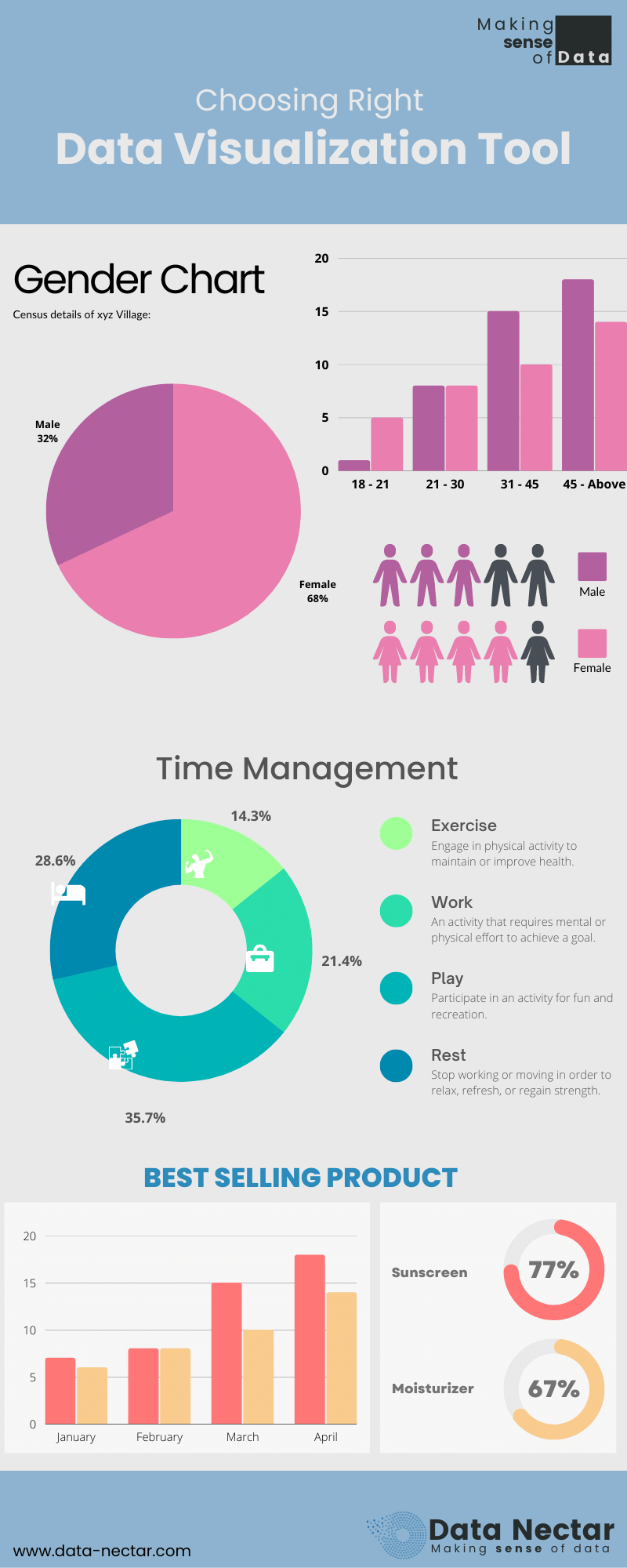
- Data visualization – competence to visualize and illustrate data through graphic aids such as charts, graphs, and various figures
- Econometrics – the skill to create mathematical models from the data trends that can predict future trends
- Mathematical & statistical ability
- Soft-skills:
- Analytical mindset – An analyst must be able to analyze the data from multiple points of view to understand what’s happening and to dig deeper if necessary.
- Problem-solving skills: Data analytics is all about answering questions and solving business challenges, and that requires some keen problem-solving skills. Data analysts have a wide variety of tools and techniques at their disposal, and a key part of the job is knowing when to use what.
- Communication skills: Once you’ve harvested your data for valuable insights, it’s important to share your findings in a way that benefits the business. Data analysts work in close collaboration with key business stakeholders and may be responsible for sharing and presenting their insights to the entire company. So, if you’re thinking about becoming a data analyst, it’s important to make sure that you’re comfortable with this aspect of the job.
What will be the role of a Data Analyst in your organization?
A data analyst collects all the scattered pieces of a large complex jigsaw data puzzle and creates a meaningful picture so that others can use that information. So if you choose to employ a full-time Data Analyst, his/her responsibilities will be like these.
- To manage the delivery of user behavior surveys and create reports based on the results.
- Work with clients to develop requirements, define success metrics, manage and execute analytical projects, and evaluate results.
- Monitor practices, processes, and systems to identify opportunities for improvement.
- Coming up with good questions and translating them into well-defined analytical tasks.
- Gather new data to answer client questions, collating and organizing data from multiple sources.
- Devise, build, test, and maintain back-end code.
- Establish data processes, define data quality criteria, and implement data quality processes.
- Work as part of a team to evaluate and analyze key data that will be used to shape future business strategies.
As a business leader, it must be an obvious matter for you to be aware of how crucial thing Data Analytics is. Also how vast a subject it is, and what level of complexities it involves. Therefore you must have employed a proper Data Analytics system and experts to run that system.
However, the subject being a relatively recent phenomenon, it’s far from being practical that every organization would have its own team of Data Analytics experts.
Therefore it’s wise to have an external partner like us to direct and manage this matter.
We, at DataNectar, have a team of veterans who understand not only Data Science & Engineering but also the business processes in multiple industries thoroughly. They will be able to objectively study your business and come up with the parameters for analysis and also devise appropriate algorithms to extract information from the data.
We employ a system to extract the data from multiple data sources.
Clean the data up and store them in a defined order in a warehouse.
Take the data through a transformation procedure. And Create various visually understandable dashboards and analyses.
By the way, we will choose the best tools for different steps in the entire BI exercise, and also set up automation wherever required.
After having done this exercise,
We sit with the team of the leaders of your business to support the brainstorming for interpreting the analysis.
We also support brainstorming for predicting the oncoming trends and Strategizing to take optimum advantage of those trends.
At this stage, we’d like to offer you a free consultation for 15 minutes over the phone to understand your business issues. At the end of that conversation, either party can decide whether we are fit to work together or not. If we feel there is a synergy, we can set up a time for the next meeting, and if we don’t, we can still be friends.
Feel free to contact us at [email protected] or visit our website at www.data-nectar.com