
Data is getting immense with every passing year and in nearly all industries. As metrics pile up considerably, you, as an organizational decision-maker, may find yourself confused about which data points collected are essential and in what approaches they can assist your business operations.
All of this data is tough for the human brain to grasp. It is tricky to comprehend numbers more significant than five for a human brain without sketching some abstraction. Data visualization professionals can play a vibrant role in generating those abstractions.
Big data is impractical if it can’t be understood and digested conveniently. That is why data visualization plays a significant role in the whole thing, from economics to technology, enabling decision-makers in IT companies and end users of BI technologies like hospitals and industries like manufacturing.
By converting multifaceted numbers and other pieces of data into visual elements, content becomes simpler to comprehend and use in diverse applications.
So, here, you require data visualization techniques and need to select the best tools that can maximize your utilities.
What is Data Visualisation?
Data visualization in simple terms is an arrangement of visual elements of a set of data that is highly interactive, intuitive, personalized, and easy to share.
For instance, text-based data is visualized graphically in the outline of charts, graphs, tables, Infographics, and maps to analyze business or operational scenarios.
So, by manipulating big data sets in the form of visual formats, you can clearly understand the story your data depicts at a swift glance, instead of working on piles of tables and numbers for long hours.
How does it Enable Business Intelligence Dynamics?
Now coming to the context of Business Intelligence (BI) dynamics, data visualization is used and applied in two ways.
Data is visualized in form of Dashboards that represent business data from every angle by allowing one to measure its performance in any dimension. Data can be drilled down and dissected any information. We can slice & dice the information in any unit size.
Do you want to know what valuation Business Intelligence (BI) can bring to your organization?
Data Visualisation can Assist your Organisation with Diverse Approaches
How does data visualization help decipher digital information?
Large and ever-altering quantities of data related to your business’s health, such as customer interactions, user experiences, staff performance levels, and expenditures can robustly impact and influence the overall decision-making at crucial moments. However, this is only probable when such data is clearly understandable even by non-data professionals.
With data visualization, you can translate scores of text and numbers to instinctively understandable insights. A step further, visualization tools can transform raw metrics into insightful stories that can be easily shared and worked upon.
How can data visualization help discover trends swiftly?
Data visualization facilitates your organization to spot alterations in customer behavior and market conditions swiftly. For instance, by utilizing heat maps, one can rapidly spot expansion opportunities, which is not evident in spreadsheets.
On the other hand, Radius maps enable you to focus on spatial relationships for realizing enhanced business efficiencies or oversupply.
Further, with territory mapping, your sales teams can easily view their territories and ensure they are aligned or not.
How does data visualization help with decision analysis?
When you feed precise and neutral data visualizations into the decision-making tools, you can make enhanced decisions for your organization. Accurate data visualizations don’t deform the original information with unreliable displays.
Additionally, charts and dashboards should be updated with dynamism using the newest information keeping the decision-making analysis highly applicable and relevant.
How data visualization reveals flaws, fraud, and anomalies?
Erroneous data can lead to a severe threat to businesses that depend on their correctness and accuracy levels. Data visualizations like charts and graphs can swiftly highlight large discrepancies in data readings, specifically signaling, where more careful reviewing of the numbers may be crucial.
Identifying and visualizing data patterns
Data visualization software enables you to identify and visualize data patterns with relationships that occur amid daily operations and overall business performance.
However, you should be cautious of inappropriate comparative visualizations as if your organizational data analysis is puzzling or tough to compare; your visualizations might be doing more damage than enhancements.
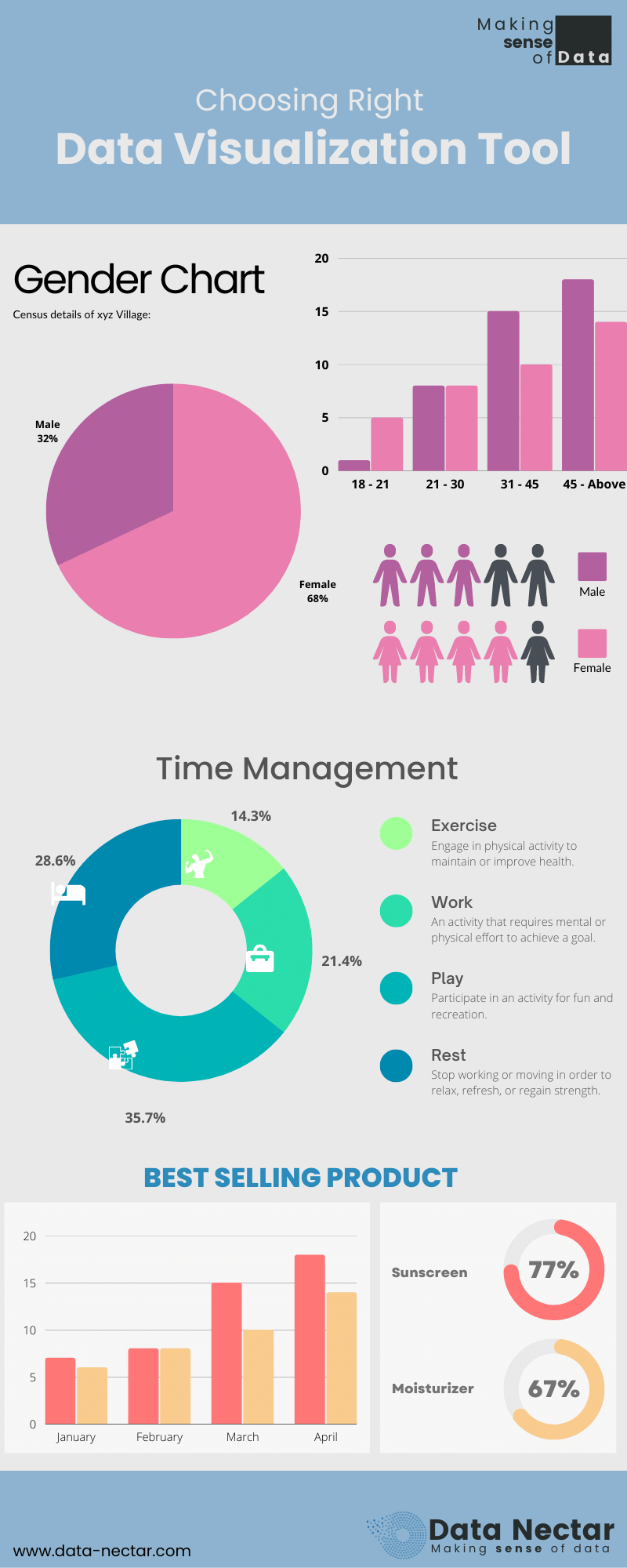
Following are two charts that illustrate:
a) Poor Data Visualisation,
b) Enhanced Data Visualisation through Dashboard.
a) Poor Data Visualisation:
b) Enhanced Data Visualisation through Dashboard.
Let us further explore the bad data visualization and good data visualization examples in detail.
Example of Bad Data Visualization
#1: Pie chart with multiple categories
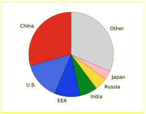
Pie charts are leveraged when 2 to 3 product items make up the complete data set. Any more than that, and it is tough for the human eye to differentiate between the parts of a circle.
Notice how difficult it is to differentiate the size of these diverse parts.
What is the exact difference between India and Russia?
It is rough to calculate the exact size difference. Rather, substitute this with a bar chart.
Example of Good Data Visualization: Precise Bar Chart
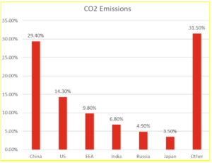
Here you can explicitly calculate the difference between India (6.80%) and Russia (4.90%).
Bar charts will be your go-to option for exact data visualization.
7 Best Data Visualization Tools Which Are Popular In 2022-23
1. Power BI
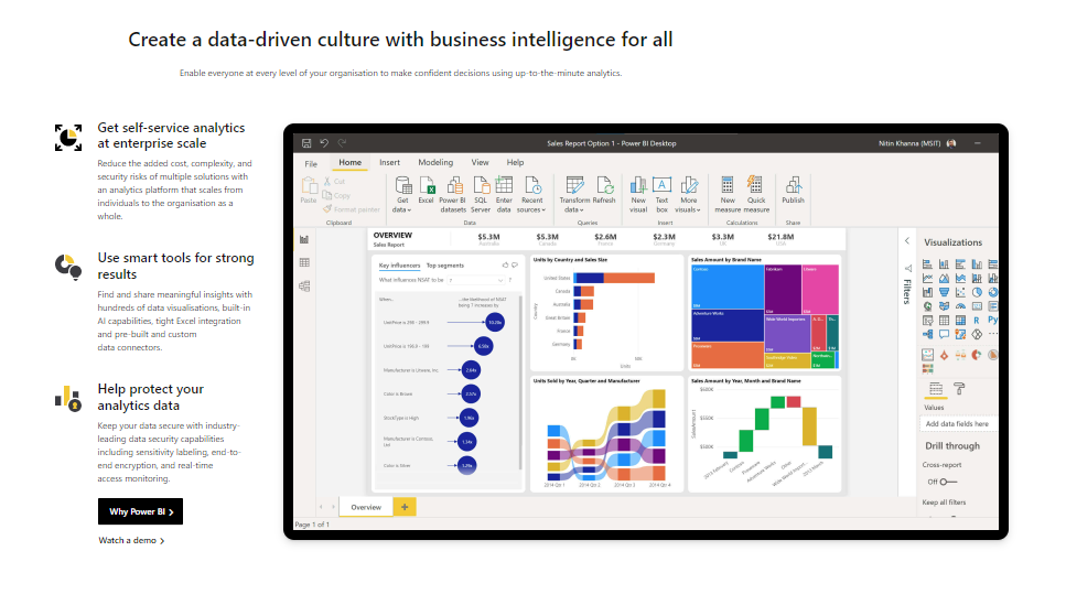
Power BI is effortless to set up with dashboards and data connectors to on-premise and cloud-based sources such as Salesforce, Azure SQL DB, or Dynamics 365. The open framework enables the creation of custom visuals.
It possesses default data visualization elements with bar charts, pie charts, maps, and even complex models like waterfalls, funnels, gauges, and other components.
Power BI is developed and enabled with machine learning abilities, so it can automatedly spot patterns in data using them to make informed predictions through “what if” scenarios. These estimates facilitate users to make forecasts and meet future demands or significant metrics.
A user can easily save his work to a file, and publish data and reports through Power BI to share with other stakeholders. Power BI is utilized to develop custom dashboards as well as reports as per the relevancy and access of data.
Through custom visuals SDK, one can generate stunning visualizations, based on rich JavaScript libraries like D3, jQuery, and R-language scripts.
You also might like to read more about our best case study which is Remodelling advertising pricing strategy with Data Analytics
2. Tableau
Tableau has an extensive customer base of more than 57,000 accounts because of its capability to generate interactive visualizations far beyond those offered by standard BI solutions.
It is best for managing massive and quickly altering datasets utilized in Big Data operations, machine learning, and artificial intelligence applications. Further, it can be integrated with modern database solutions including Amazon AWS, Hadoop, My SQL, Teradata, and SAP.
Developing content in Tableau doesn’t need conventional source control or dev-test-prod-related techniques. You can integrate Tableau content development and deployment into your present development systems.
Publishing data to Tableau is integral to sustaining a single source for accessible data. Publishing facilitates sharing data with colleagues; even those not using Tableau Desktop, however, have required editing permissions.
The top features of Tableau include Tableau Dashboard, Collaboration and Sharing, Live and In-memory Data, Data Sources, Advanced Visualizations (Chart Types), Maps, Mobile view, and robust security. D3.js is an exclusive JavaScript library that is utilized for Tableau data visualization.
3. MicroStrategy
MicroStrategy provides intuitive tools with data discovery and big data analytics features with an extensive library to visualize data.
The MicroStrategy platform backs engaging dashboards, scorecards, advanced reports, thresholds, alerts, and automated report distribution. The tool can connect to over 200 data sources which include RDBMS, Cloud data, OLAP, and Big data.
Dossiers are MicroStrategy’s advanced and modern dashboards. To make the dossier to be presentation-ready, one requires to certify it to validate that the content is trustworthy. Once certified, you can share it with the enterprise environment for collaboration and publishing.
MicroStrategy Library is a unique and personalized virtual bookshelf that enables you to access dossiers from one common location. Through the MicroStrategy library, you can reach out to subject matter specialists and have a conversation regarding your data visualizations.
4. Qliksense
The vendor has 40,000+ customer accounts across 100+ countries, offering a highly adaptable setup and extensive features.
Along with its data visualization abilities, the Qliksense tool even provides business intelligence, and enables the storytelling capacity of dashboards, data analytics, and reporting with a sleek user interface.
There is also a sturdy community and 3rd party resources obtainable online to assist fresh users in understanding how to incorporate it into their current projects.
The Qliksense dashboard is an influential feature to showcase values from multiple fields simultaneously, and its functionality of data association in memory can showcase the dynamic values in all the available sheet objects.
Qlik DataMarket® is an integrated data-as-a-service (DaaS) of Qlikview offering an all-inclusive library of data sets from reliable sources. Qliksense developers can use the same and effortlessly enable their analyses with external data sets to have an “outside-in” perspective for deeper insights.
5. Google Data Studio

Google Data Studio is a tool that enables communication and acts on tailored data sets. Programmers, executives, and worldwide team members from diverse departments can match, filter, and well-organize the precise data sets they require swiftly in one single report. No more waiting for numerous and static data reports to fill their inbox.
Data Studio is now an integral part of Google Cloud’s BI solutions. By blending Data Studio with Looker, Google Cloud has the finest of both ends – a structured semantic model and a self-served, simple-to-use front-end app with Data Studio that enables the analysis of unstructured/ungoverned data sets.
6. Apache Superset
Apache Superset is an advanced exploration and data visualization platform. It can substitute or enhance proprietary BI tools for many teams. It blends well with a diversity of data sources.
It offers a no-code interface for swiftly crafting charts. It provides a powerful web SQL Editor for progressive querying and a lightweight semantic layer for rapidly defining custom dimensions and precise metrics.
It provides an extensive array of attractive visualizations to display your data sets, ranging from straightforward bar charts to geospatial visualizations.
7. Looker
Looker Studio is a self-service BI with unmatched suppleness for intelligent business decisions. It helps tell powerful stories by building and sharing interactive reports and data visualizations.
It assists in transforming your data sets to business metrics and dimensions with intuitive, intelligent reports. The tool enables professionals with significant business metrics by sharing automated dashboards. It helps you generate shareable, tailored charts and graphs with merely a few clicks.
Moving Forward
Extract, transform & load (ETL) are 3 data processes, enabled after data collection.
Extraction takes data, collected in varied data sources with diverse structures and formats, to the staging database.
Transformation takes fetched data and applies predefined rules to it, and load takes the transformed data and stores it in Data Warehouse (DW).
However, this data is multifaceted until it is parsed and showcased in a simplified way.
Specialists at Data Nectar enable the seamless consumption of significant insights by transforming the data analysis into visual representations with the assistance of Reports and Dashboards to decipher trends, anomalies, and data usage patterns.
At Data Nectar, a data analytics and visualization technology company, we know the real significance of Data Visualization for multiple stakeholders, and we can assist you in choosing precise tools in line with your requirements.
Further, we enable SMEs and Enterprises with analytics-driven technology solutions to realize enhanced performance and maximize ROI in the process – through data.
If you all too, as your organization’s decision-makers are willing to discover the vast possibilities Data can bring to your business or industry operations, Call Us Today!