Getting Started with Power BI: Introduction and Key Features

Getting Started with Power BI: Introduction and Key Features

As You are here, congratulations on the first step toward a data-driven business journey. In today’s data-driven world, we all rely on data to make informed decisions in one way or another. Power BI was developed by Microsoft, a powerful business analytics service that empowers users to harness the potential of their data and transform it into actionable insights. In this comprehensive introduction to Power BI, we’ll explore what it is, its key features, why it matters, and real-world use cases.

What is Power BI?

At its core, Power BI is a versatile data analytics and data visualization tool. Users can connect to various data sources, transform raw data into meaningful insights, and create interactive business dashboards and paginated reports. 

Key Features and core concepts to start with Power BI 

To understand Power BI, it is necessary to understand the core elements of Power BI that encompass data analytics and reporting suites. 

1. Creative Dashboard Design: 

Power BI should be considered a self-service BI tool as it provides a wealth of data visualization options, using charts, cross-tab tables, maps, and more with great formatting functionalities for informative reports and dashboards. These dashboards can be printed or shared using Power BI services. 

2. Smart Dataset Filtering 

Using Power BI massive datasets can be filtered to zoom in on the stuff we want to refer to. It’s like focusing on specific data without drowning in the entire sea of information.

3. Data Connectivity

To analyze data, we first need the connectivity of different data sources. Power BI supports diverse data sources; including databases (SQL Server, Oracle), cloud services (Azure, AWS), online services (Google Analytics, Facebook), and local files (Excel, CSV).

4. Data Modeling

Once various data sources are connected to Power BI, the importance of data modeling can’t be overstated as it forms the foundation; establishing relationships between different data tables, and improving data quality and well-structured data contributes to better query performance. 

5. Explore Data

Power BI’s drill-down functionality allows users to seamlessly explore data from high-level summaries down to granular transaction details. This hierarchical navigation provides transparency into the intricacies of the data, fostering a dynamic and interactive reporting experience. With customizable detail views, users can tailor their analyses, making Power BI a powerful tool for in-depth data exploration and insight generation.

6. Real-time Data

Power BI allows for real-time data analysis, ensuring that you’re always working with the most current information.

7. Power Query

Power Query is a built-in data transformation tool that enables you to shape and transform your data before analyzing it. It helps clean, filter, and format your data for optimal use.

8. The Statistical Language R

Power BI supports widely used Statistical Language R., Data Analytics is not just representing data in charts and table format. Statistical models can recognize patterns within datasets and can predict or forecast based on historical data. Statistical models also help in Hypothesis testing, risk management, decision support, segmentation & targeting, along machine learning.


You can refer link to Microsoft has comprehensive details about data sources supported by Power BI

Above are core concepts to start with Power BI, though Power BI is distributed among the following platforms, 

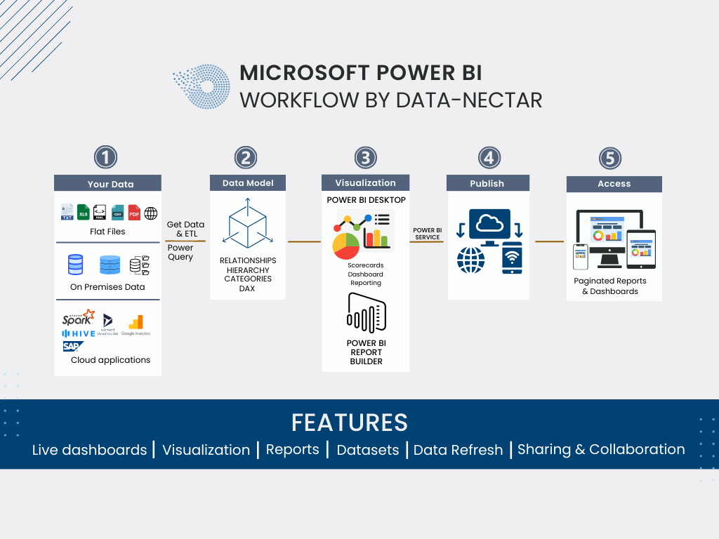
  • Power BI Desktop – A free desktop application for Dashboard and Reports creation. 
  • Power BI Service – Microsoft-owned cloud platform to collaborate & distribute visualization/dashboards and reports. 
  • Power BI Mobile – We need data at our fingertips, thus Power BI mobile is a mobile application that allows us to interact with reports and dashboards over mobile devices and tablets. 
  • Power BI Report Builder – Power BI Report Builder is the modern successor to SSRS and it is part of the Power BI suite with enhanced capabilities to build paginated reports, effectively integrating traditional reporting functionality with the broader Power BI platform. Power BI Reports can be easily embedded into your custom web applications since Power BI provides a simple-to-implement framework. 
  • Power BI Report Server – On-premises report server to distribute reports, it is available through a Power BI Premium license.

For a better basic understanding of Power BI, refer to the following basic FAQs related to Power BI. 

1) How do I download and install Power BI Desktop?

To download and install Power BI Desktop, visit the official Microsoft Power BI website, click on the “Download free” button, run the downloaded installer, and follow the on-screen instructions to complete the installation on your Windows machine.

2) What are the system requirements for Power BI Desktop?

Power BI Desktop requires a 64-bit version of Windows 7 or later, at least 1 GB RAM (2 GB recommended), and a display with a resolution of 1024×768 or higher. It’s compatible with x86 or x64 processors.

3) Is Power BI available for Mac?

Presently, Power BI Desktop is exclusively supported on Windows and isn’t directly installable on Mac systems. To use Power BI Desktop on your Mac, you may explore options such as running it on a virtual machine or utilizing a cloud service.

4) How can I create a Power BI account?

To create a Power BI account, go to the official Power BI website, click on “Sign up free,” provide your email address, follow the registration steps, and create a password. You’ll then have access to Power BI service and can start building and sharing reports.

5) What is the difference between Power BI Desktop and Power BI Service?

Power BI Desktop is a standalone application for creating reports and visualizations on a local machine, while Power BI Service is a cloud-based platform for sharing, collaborating, and publishing reports online. The desktop is used for report development, and the Service is used for hosting and sharing those reports in a collaborative online environment.

6) Can I use Power BI without an internet connection?

Yes, you can use Power BI Desktop without an internet connection for creating and modifying reports locally on your machine. However, to share, publish, and collaborate on reports, you’ll need an internet connection to utilize Power BI Service, which is cloud-based.

7) How do I get data into Power BI?

In Power BI, you can get data by clicking on “Get Data” in Power BI Desktop, selecting a data source (such as Excel, SQL Server, or online services), connecting to it, and importing or transforming the data as needed. Power BI supports a wide range of data sources for analysis and visualization.

8) What data sources does Power BI support?

Power BI supports various data sources, including Excel, SQL Server, Azure services, SharePoint, online services (such as Google Analytics and Salesforce), and many others. It also allows connections to on-premises data sources and supports a wide range of file formats.

9) Can I connect to on-premises data sources with Power BI?

Yes, Power BI enables connections to on-premises data sources using methods like DirectQuery or importing data. You can connect to on-premises databases, servers, and other sources to analyze and visualize the data within Power BI.

10) Is there a mobile app for Power BI?

Yes, there is a mobile app for Power BI available for both iOS and Android devices.  You can download it from the respective app stores to access and interact with your Power BI reports and dashboards on the go.

11) What is Power BI Pro and Power BI Premium?

Power BI Pro is a subscription plan that allows individual users to collaborate, share, and consume content created in Power BI. Power BI Premium, on the other hand, is a capacity-based licensing model designed for larger organizations with heavier workloads. It offers dedicated resources, enhanced performance, and the ability to share reports with free Power BI users.

12) How do I share reports and dashboards with others?

To share reports and dashboards in Power BI, you can publish them to the Power BI service, create a dashboard, and then share it with specific users or groups. For advanced collaboration, you may need Power BI Pro or Power BI Premium subscriptions, depending on your organization’s needs.

13) Can I embed Power BI reports in other applications? 

Yes, you can embed Power BI reports in other applications using the Power BI Embedded service or leveraging the Power BI REST API. This allows you to integrate Power BI reports seamlessly into custom applications or websites.

Recent Post

Custom AI Solutions – Tailoring AI to Your Unique Needs in 2024

[pac_divi_table_of_contents included_headings="off|on|on|off|off|off" scroll_speed="8500ms" level_markers_3="none" title_container_bg_color="#004274" _builder_version="4.22.2" _module_preset="default" vertical_offset_tablet="0" horizontal_offset_tablet="0"...

Driving Business Efficiency through Microsoft Dynamics 365 Enterprise Resource Planning (ERP) Integration

Driving Business Efficiency through Microsoft Dynamics 365 Enterprise Resource Planning (ERP) Integration

Want to improve business efficiency and simplify processes? Have you explored Microsoft Dynamics 365 ERP integration? If you need help, let’s see how this broad range of software may transform your business. Let’s explore Microsoft Dynamics 365 ERP and its business-changing potential.

According to a study, 95% of companies that implemented ERP noticed real benefits, with 96% getting better data quality and 92% streamlining their business processes.

Microsoft Dynamics 365 ERP, also known as Enterprise resource planning, is a software system that helps businesses automate and control their most important business processes to run as smoothly as possible. Enterprise resource planning (ERP) software helps streamline business operations by centralizing data and ensuring department consistency.

How does Microsoft Dynamics 365 ERP help a business?

While it is acknowledged that there is no universally applicable solution for all business processes, it is worth noting that Enterprise Resource Planning (ERP) technology has been continuously improving in its ability to connect many techniques.

Here are three ways that an ERP system can help your company.

1. Optimize speed

With AI-based solutions, you can get insights that help you make better decisions and show you how to improve business performance going forward.

2. Speed up the effect of operations.

Integrating procedures and data will give employees increased insight and flexibility to respond swiftly and effectively, ultimately benefiting the company.

3. Maintain a flexible approach to business.

Many ERP systems are made to adapt to your needs and grow your business. It lets you plan for operational disruptions or changes in the market and react quickly to them.

What is Microsoft Dynamics 365 ERP?

Most businesses already have a finance and operations system in place, but separate systems can’t help with business growth or go beyond day-to-day business tasks.

As a business grows and its needs change, its processes should be able to keep up.

Dynamics 365 Finance and Operations refers to a comprehensive business application suite developed by Microsoft ERP Solutions that encompasses many functionalities related to financial management and operational processes.

The platform and technology built upon Microsoft Azure demonstrate interoperability with other complementary solutions and platforms, such as Microsoft Office and the Power Platform.

Dynamics 365 offers a comprehensive overview and a suite of collaborative capabilities to facilitate effective decision-making.

What is Microsoft Dynamics 365 Finance and Operations?

Dynamics 365 for Finance and Operations encompasses cloud-based enterprise resource planning (ERP) solutions. The selection of applications and elements inside the answer is determined at the specific company’s discretion.

The inclusion of Microsoft ERP solutions inside the Dynamics 365 package is of paramount importance. It implies that the feature can be provided and incorporated with other components inside Dynamics 365, such as Dynamics 365 Sales, Dynamics 365 Human Resources (Talent), and Field Service, among other possibilities.

1. Dynamics 365 Finance

Dynamics 365 Finance is a software application developed by Microsoft that focuses on financial management and accounting processes within organizations.

2. Dynamics 365 Supply Chain Management

Dynamics 365 Supply Chain Management is a software solution developed by Microsoft that focuses on managing and optimizing supply chain operations inside an organization.

3. Dynamics 365 Commerce

Dynamics 365 Commerce, also known as Dynamics 365 Retail, is a comprehensive software solution developed by Microsoft. It is designed to cater to the needs of the retail industry, providing a wide range of functionalities.

The Microsoft ERP solutions are presented as a single application for everyday use, but they are marketed as separate solutions based on the current pricing model.

Together, these entities offer the comprehensive and well-established capabilities that were previously available in Dynamics AX.

Benefits of Dynamics 365 ERP Integration

There are a wide range of Benefits of Dynamics 365 ERP Integration. We have derived a few of them below.

  • Dynamics 365 ERP integration unifies and automates business tasks, enhancing data flow and efficiency.
  • ERP Integration with Dynamics 365 removes manual data entry and its inaccuracies, improving data accuracy and reliability.
  • Integrating vital corporate data allows for real-time decision-making and reduces data silos.
  • Integration can save time and money by automating and eliminating repetitive procedures.
  • An integrated ERP system can expand your organization and handle more data and complexity.
  • ERP Integration with Dynamics 365 systems can expand your organization and handle more data and complexity.
  • Integrating data management improves data security and makes it easier to comply with industry requirements and data protection standards.
  • Integrated ERP systems provide a comprehensive perspective of the firm, allowing improved data analysis and actionable insights to optimize operations and strategy.

Wrapping It Up

The implementation of Microsoft Dynamics 365 Enterprise Resource Planning (ERP) into organizational workflows has the potential to enhance operational efficiency and promote corporate expansion significantly. Businesses that use ERP integration will benefit from being ahead of the curve, adjusting to change, and flourishing in dynamic marketplaces as technology continues to advance.

Recent Post

Custom AI Solutions – Tailoring AI to Your Unique Needs in 2024

[pac_divi_table_of_contents included_headings="off|on|on|off|off|off" scroll_speed="8500ms" level_markers_3="none" title_container_bg_color="#004274" _builder_version="4.22.2" _module_preset="default" vertical_offset_tablet="0" horizontal_offset_tablet="0"...

Data Visualization Best Practices for Complex Datasets

Data Visualization Best Practices for Complex Datasets

Data visualization is essential for visually representing and conveying complex data sets to a larger audience. Typically, data is presented in charts and diagrams; however, converting it into a narrative-driven story can significantly improve its accessibility and contextual comprehension for executives. 

What is Data Visualization?

Data visualization is the process of converting unstructured data into more visually appealing forms like graphs, charts, and maps. It has rapidly gained notoriety for publishing information on the Internet.

It’s used everywhere, from Business intelligence to journalism, to understand better and communicate the meaning of data. Displaying data visually facilitates comprehension and analysis and is regarded as an industry best practice.

It also helps people make decisions faster and find patterns, both new and hidden, that help them understand challenging concepts in a better way.

When information is represented graphically, anyone can understand the most complex data visualization concepts easily and quickly. Power BI and Tableau are two examples of technical knowledge-free tools that make learning easier without technical skills.

What are Data Visualization’s Primary Objectives?

When creating datasets for visualizations, it is essential to set goals and objectives. Here are some factors to consider when creating your data visualization datasets:

  • Data visualizations are beneficial for emphasizing data trends, patterns, and correlations.
  • Data visualization is an efficient decision-making measure that enables management to make well-informed, data-driven decisions.
  • Data visualizations facilitate the comprehension of large datasets and the combination of datasets from diverse sources.
  • It is an effective method for communicating ideas supported by data through narratives.
  • Data visualizations must capture the focus of the intended audience while being simple to comprehend and interpret.
  • Data visualizations facilitate monitoring crucial metrics and key performance indicators (KPIs).

Data visualization best practices

1. Identify the target audience and their specific needs

There are better ways to give customers information than creating visualizations and putting them all on a dashboard. One may not fit all. We must do more than compare notes, keep tabs on conduct, and evaluate output. It would help if you asked this question before preparing data visualization datasets.

Who is our target audience?

Understanding our most important user persona is crucial when creating a dashboard. Where do we stand in terms of overcoming challenges? What can we do to overcome those challenges? Create a dashboard that anyone can use and has all the features they need.

What do I want the user to decide?

Decision-making guidance is required. Is this a risky move? Is this profitable? If I decide to purchase this house or not. Multiple meetings per day, week, or month may be necessary to conclude a particular matter. Therefore, your visualization should be made to provide you with a yes/no answer.

2. Choose the right data visualization graphs

Choosing the right type of data visualization graph can increase your visualizations’ clarity and readability and make them more interesting to the viewer. Make smart comparisons and employ charts appropriate for the data type when using these visualizations. Choosing the right visualization approach requires considering your data’s context, audience’s needs, and objectives.

Examples of effective data visualization graphs are provided below. Bar charts, or charts with rectangular bars, are frequently used to graphically represent categorical data. They are widely employed due to their efficiency in conveying information and facilitating value comparisons and their utility in illustrating distributions.

Line graphs: Graphs that use lines to connect data points are called “line graphs.” They come in handy when drawing a graph to show recurring patterns in data, like a time series. Variables such as the weather, stock markets, sales, etc., are good examples.

Scatter plots: Relationships between variables are displayed graphically in scatter plots, which are useful for depicting how variables impact each other and spotting data patterns.

Pie charts: Pie charts are a type of bar chart in which each section of the circle represents a different size of the displayed data. Multiple charts, each representing a different period, illustrate the distribution of, or change in, a given quantity or percentage.

Box and Whisker plots: Graphical representations of the minimum, maximum, median, first quartile, and third quartile values in a dataset are known as box plots (or box and whisker plots). In particular, they help you identify outliers and understand the overall structure of your data.

Violin plots: Like box plots, violin plots show how a dataset is distributed. Kernel density plots can be used to display the minimum, maximum, median, and quartiles of a dataset and its distribution. You can use them to find outliers in your data or examine how data is distributed across different groups.

To view more details about how to choose the best data visualization tools

3. Carefully and deliberately apply text

The most important information should be located in the top left corner, where the eye naturally travels first. You should include at least three or four views in a single dashboard. Because adding too many graphs will make the presentation clearer. Group filters into one and frame it with a transparent border to make it look nicer.

4. Design following the standard format

The human eye is very good at picking up cues that aid in making sense of data. Visualization can be difficult to understand if the patterns you can discern are random or make no sense. Whether sequential or numerical, data must be presented in a way that is easy to understand for the audience if we are to gain insight into how the human mind works.

Any charts or graphs you use should be legible and make it easy to see how your data fits together. Avoid causing your audience any unnecessary confusion; this technique is not recommended, and users can easily navigate from one point to another.

5. Hierarchy

The idea of hierarchy is a fundamental principle in design, and it is especially useful when creating data visualizations and dashboards. As mentioned, there is a standard widget layout that users will recognize immediately and understand without any training. A proper hierarchy is crucial for making data visualizations and dashboards scannable.

A few easy ideas define a hierarchy:

  • The top left corner of the dashboard is a prime location because that’s where most people’s eyes naturally go first. 
  • The widgets after the top level should provide context for the KPIs there. 
  • You can use text widgets to make titles to help explain the information better.
  • Blank space can be just as effective. It’s better to leave a void than to fill it with something unnecessary.

6. Keep Titles and Labels Brief

Labels and titles should be used for your visualizations and be easy to understand. The purpose of the visual representation and its intended meaning should be communicated via these labels.

A number of guidelines should be followed when designing titles and labels, such as making sure to use legible fonts, using a large enough font size, positioning labels strategically, and using a color that is easy on the eyes.

Avoid using unnecessary abbreviations and keep labels at a reasonable distance from one another to improve readability. If you must use abbreviations, provide a key explaining what they stand for.

7. Select Appropriate Colors 

Colors are a powerful tool in data visualizations, keeping the viewer interested in the dashboard’s (or report’s) content and drawing their attention to key points.

The colors you use for your titles, labels, charts, etc., should be chosen with brand consistency (such as using your company’s brand colors) and readability.

Visuals should be appealing and should not have too many colors. Also, consider how the psychology of color might affect how your audience responds. Finally, people with visual impairments should be considered when choosing color schemes for their visualization.

Keep your visuals simple and organized by using a limited color palette.

8. Analyze Business Intelligence

Finding data interaction is challenging in today’s competitive environment. One of its most crucial recommendations is to focus on discovering the connections between data and new business insights.

Every company should review these thoughts to make sure they are heading in the right direction. It’s useful for keeping up with the times to serve your customers better.

It’s also useful for spotting issues before they become problematic. You can boost sales and revenue by keeping up with the latest developments.

9. Use clean and current data

For visualizations, data quality is very important. You’ll need to clean and precondition your data to remove any unusual patterns or mistakes.

This procedure may include data normalization, the removal of duplicates, etc., may be part of this process. Aside from the accuracy and clarity problems that dirty data introduces to analysis and visualization, it also makes it harder to use.

When making decisions in your company, you don’t want to use inaccurate or outdated information. You should use the most recent and applicable data available to guarantee that your visualization is up-to-date and accurate.

When Creating data visualization best practices, What should we look for?

Now that we’ve covered some data visualization best practices let’s talk about what makes good datasets for visualization. 

  • A well-executed data visualization makes complicated connections clear, concise, and clutter-free.
  • The main ideas you want to convey are easily understood. Your audience should be able to quickly and easily grasp your insights.
  • The visualizations should show the concepts and details in the data by using the right visual elements.
  • Good data visualizations can cater to a wide range of viewers by using easily readable fonts and various text sizes. Make good use of contrast and color schemes. Due to the prevalence of red-green color blindness, avoiding combinations involving those hues is best.
  • Good data visualization is uncomplicated and easy to understand, with no unnecessary components.
  • Accurate, up-to-date, and trustworthy data is the foundation for good data visualization.

Which Data Visualization Method Is Most Effective?

The most effective data visualizations are those that immediately convey the intended meaning. The data is presented in a way that makes sense for the data being dealt with. Design, readability, and understandability are also taken into account.

How to Recognize a Good Data Visualization?

The quality of data visualization can be evaluated according to the following criteria:
Look at how the visualization uses color, labels, and other design elements.

  • Do the texts have the right amount of information, and are they easy to read?
  • Does it make the data easier to understand and use for your intended audience?
  • Is the dashboard/visualization displaying data in the correct proportions?
  • Is it possible to read the visualization for those who have low vision?
  • Is the visual representation clear and interesting?
  • Does the visualization’s color scheme draw attention to significant patterns?

Final Words On Data Visualization Best Practices

Data visualizations are the best way to keep track of your company’s metrics and key performance indicators (KPIs). If you follow the best practices for making a data visualization, you can make reports that are easy to understand and help you find patterns or outliers. 

Recent Post

Custom AI Solutions – Tailoring AI to Your Unique Needs in 2024

[pac_divi_table_of_contents included_headings="off|on|on|off|off|off" scroll_speed="8500ms" level_markers_3="none" title_container_bg_color="#004274" _builder_version="4.22.2" _module_preset="default" vertical_offset_tablet="0" horizontal_offset_tablet="0"...

How to Choose the Best Data Visualization Tools

How to Choose the Best Data Visualization Tools

Data is getting immense with every passing year and in nearly all industries. As metrics pile up considerably, you, as an organizational decision-maker, may find yourself confused about which data points collected are essential and in what approaches they can assist your business operations. 

All of this data is tough for the human brain to grasp. It is tricky to comprehend numbers more significant than five for a human brain without sketching some abstraction. Data visualization professionals can play a vibrant role in generating those abstractions.

Big data is impractical if it can’t be understood and digested conveniently. That is why data visualization plays a significant role in the whole thing, from economics to technology, enabling decision-makers in IT companies and end users of BI technologies like hospitals and industries like manufacturing.

By converting multifaceted numbers and other pieces of data into visual elements, content becomes simpler to comprehend and use in diverse applications.

So, here, you require data visualization techniques and need to select the best tools that can maximize your utilities.

What is Data Visualisation?

Data visualization in simple terms is an arrangement of visual elements of a set of data that is highly interactive, intuitive, personalized, and easy to share. 
For instance, text-based data is visualized graphically in the outline of charts, graphs, tables, Infographics, and maps to analyze business or operational scenarios. 

So, by manipulating big data sets in the form of visual formats, you can clearly understand the story your data depicts at a swift glance, instead of working on piles of tables and numbers for long hours.

How does it Enable Business Intelligence Dynamics?

Now coming to the context of Business Intelligence (BI) dynamics, data visualization is used and applied in two ways. 

Data is visualized in form of Dashboards that represent business data from every angle by allowing one to measure its performance in any dimension. Data can be drilled down and dissected any information. We can slice & dice the information in any unit size.

Do you want to know what valuation Business Intelligence (BI) can bring to your organization?

Data Visualisation can Assist your Organisation with Diverse Approaches

How does data visualization help decipher digital information?

Large and ever-altering quantities of data related to your business’s health, such as customer interactions, user experiences, staff performance levels, and expenditures can robustly impact and influence the overall decision-making at crucial moments. However, this is only probable when such data is clearly understandable even by non-data professionals.

With data visualization, you can translate scores of text and numbers to instinctively understandable insights. A step further, visualization tools can transform raw metrics into insightful stories that can be easily shared and worked upon.

How can data visualization help discover trends swiftly?

Data visualization facilitates your organization to spot alterations in customer behavior and market conditions swiftly. For instance, by utilizing heat maps, one can rapidly spot expansion opportunities, which is not evident in spreadsheets. 

On the other hand, Radius maps enable you to focus on spatial relationships for realizing enhanced business efficiencies or oversupply.
Further, with territory mapping, your sales teams can easily view their territories and ensure they are aligned or not.

How does data visualization help with decision analysis?

When you feed precise and neutral data visualizations into the decision-making tools, you can make enhanced decisions for your organization. Accurate data visualizations don’t deform the original information with unreliable displays. 

Additionally, charts and dashboards should be updated with dynamism using the newest information keeping the decision-making analysis highly applicable and relevant.

How data visualization reveals flaws, fraud, and anomalies?

Erroneous data can lead to a severe threat to businesses that depend on their correctness and accuracy levels. Data visualizations like charts and graphs can swiftly highlight large discrepancies in data readings, specifically signaling, where more careful reviewing of the numbers may be crucial.

Identifying and visualizing data patterns

Data visualization software enables you to identify and visualize data patterns with relationships that occur amid daily operations and overall business performance. 

However, you should be cautious of inappropriate comparative visualizations as if your organizational data analysis is puzzling or tough to compare; your visualizations might be doing more damage than enhancements.

Following are two charts that illustrate: 
a) Poor Data Visualisation,
b) Enhanced Data Visualisation through Dashboard.

a) Poor Data Visualisation: 

b) Enhanced Data Visualisation through Dashboard.

Let us further explore the bad data visualization and good data visualization examples in detail.

Example of Bad Data Visualization 

#1: Pie chart with multiple categories

bad data pie chart

Pie charts are leveraged when 2 to 3 product items make up the complete data set. Any more than that, and it is tough for the human eye to differentiate between the parts of a circle.

Notice how difficult it is to differentiate the size of these diverse parts. 

What is the exact difference between India and Russia?

It is rough to calculate the exact size difference. Rather, substitute this with a bar chart.

Example of Good Data Visualization: Precise Bar Chart

good data bar chart

Here you can explicitly calculate the difference between India (6.80%) and Russia (4.90%).

Bar charts will be your go-to option for exact data visualization.

7 Best Data Visualization Tools Which Are Popular In 2022-23

1. Power BI

Power BI is effortless to set up with dashboards and data connectors to on-premise and cloud-based sources such as Salesforce, Azure SQL DB, or Dynamics 365. The open framework enables the creation of custom visuals. 

It possesses default data visualization elements with bar charts, pie charts, maps, and even complex models like waterfalls, funnels, gauges, and other components. 

Power BI is developed and enabled with machine learning abilities, so it can automatedly spot patterns in data using them to make informed predictions through “what if” scenarios. These estimates facilitate users to make forecasts and meet future demands or significant metrics. 

A user can easily save his work to a file, and publish data and reports through Power BI to share with other stakeholders. Power BI is utilized to develop custom dashboards as well as reports as per the relevancy and access of data. 

Through custom visuals SDK, one can generate stunning visualizations, based on rich JavaScript libraries like D3, jQuery, and R-language scripts.

You also might like to read more about our best case study which is Remodelling advertising pricing strategy with Data Analytics 


2. Tableau

Tableau has an extensive customer base of more than 57,000 accounts because of its capability to generate interactive visualizations far beyond those offered by standard BI solutions. 

It is best for managing massive and quickly altering datasets utilized in Big Data operations, machine learning, and artificial intelligence applications. Further, it can be integrated with modern database solutions including Amazon AWS, Hadoop, My SQL, Teradata, and SAP.

Developing content in Tableau doesn’t need conventional source control or dev-test-prod-related techniques. You can integrate Tableau content development and deployment into your present development systems.

Publishing data to Tableau is integral to sustaining a single source for accessible data. Publishing facilitates sharing data with colleagues; even those not using Tableau Desktop, however, have required editing permissions. 

The top features of Tableau include Tableau Dashboard, Collaboration and Sharing, Live and In-memory Data, Data Sources, Advanced Visualizations (Chart Types), Maps, Mobile view, and robust security. D3.js is an exclusive JavaScript library that is utilized for Tableau data visualization.

3. MicroStrategy

MicroStrategy provides intuitive tools with data discovery and big data analytics features with an extensive library to visualize data. 

The MicroStrategy platform backs engaging dashboards, scorecards, advanced reports, thresholds, alerts, and automated report distribution. The tool can connect to over 200 data sources which include RDBMS, Cloud data, OLAP, and Big data.

Dossiers are MicroStrategy’s advanced and modern dashboards. To make the dossier to be presentation-ready, one requires to certify it to validate that the content is trustworthy. Once certified, you can share it with the enterprise environment for collaboration and publishing.

MicroStrategy Library is a unique and personalized virtual bookshelf that enables you to access dossiers from one common location. Through the MicroStrategy library, you can reach out to subject matter specialists and have a conversation regarding your data visualizations.

4. Qliksense

The vendor has 40,000+ customer accounts across 100+ countries, offering a highly adaptable setup and extensive features. 

Along with its data visualization abilities, the Qliksense tool even provides business intelligence, and enables the storytelling capacity of dashboards, data analytics, and reporting with a sleek user interface. 

There is also a sturdy community and 3rd party resources obtainable online to assist fresh users in understanding how to incorporate it into their current projects.

The Qliksense dashboard is an influential feature to showcase values from multiple fields simultaneously, and its functionality of data association in memory can showcase the dynamic values in all the available sheet objects. 

Qlik DataMarket® is an integrated data-as-a-service (DaaS) of Qlikview offering an all-inclusive library of data sets from reliable sources. Qliksense developers can use the same and effortlessly enable their analyses with external data sets to have an “outside-in” perspective for deeper insights.

5. Google Data Studio

Google Data Studio is a tool that enables communication and acts on tailored data sets. Programmers, executives, and worldwide team members from diverse departments can match, filter, and well-organize the precise data sets they require swiftly in one single report. No more waiting for numerous and static data reports to fill their inbox.

Data Studio is now an integral part of Google Cloud’s BI solutions. By blending Data Studio with Looker, Google Cloud has the finest of both ends – a structured semantic model and a self-served, simple-to-use front-end app with Data Studio that enables the analysis of unstructured/ungoverned data sets.

6. Apache Superset

Apache Superset is an advanced exploration and data visualization platform. It can substitute or enhance proprietary BI tools for many teams. It blends well with a diversity of data sources.

It offers a no-code interface for swiftly crafting charts. It provides a powerful web SQL Editor for progressive querying and a lightweight semantic layer for rapidly defining custom dimensions and precise metrics.

It provides an extensive array of attractive visualizations to display your data sets, ranging from straightforward bar charts to geospatial visualizations.

7. Looker

Looker Studio is a self-service BI with unmatched suppleness for intelligent business decisions. It helps tell powerful stories by building and sharing interactive reports and data visualizations. 

It assists in transforming your data sets to business metrics and dimensions with intuitive, intelligent reports. The tool enables professionals with significant business metrics by sharing automated dashboards. It helps you generate shareable, tailored charts and graphs with merely a few clicks.

Moving Forward

Extract, transform & load (ETL) are 3 data processes, enabled after data collection. 

Extraction takes data, collected in varied data sources with diverse structures and formats, to the staging database. 

Transformation takes fetched data and applies predefined rules to it, and load takes the transformed data and stores it in Data Warehouse (DW). 

However, this data is multifaceted until it is parsed and showcased in a simplified way. 

Specialists at Data Nectar enable the seamless consumption of significant insights by transforming the data analysis into visual representations with the assistance of Reports and Dashboards to decipher trends, anomalies, and data usage patterns.

At Data Nectar, a data analytics and visualization technology company, we know the real significance of Data Visualization for multiple stakeholders, and we can assist you in choosing precise tools in line with your requirements. 

Further, we enable SMEs and Enterprises with analytics-driven technology solutions to realize enhanced performance and maximize ROI in the process – through data. 

If you all too, as your organization’s decision-makers are willing to discover the vast possibilities Data can bring to your business or industry operations, Call Us Today!